When a song you don’t like plays on your Pandora or Spotify channel, what do you do? You skip it, of course! The same thing happens to online surveys when they’re not designed well. People will choose to close out of the survey window just as fast as you hit skip to hear the next song.
Don’t let Thank You, Next become the theme of your surveys. Getting people to stick with your surveys is easy when you follow a few do’s and don’ts of survey design. People abandon surveys for many reasons, but by using some of the survey design tips below, you’ll capture people’s attention and get them to hit submit.
DO: Use colors and images.
Survey design begins with thinking about the overall look and feel of your survey. Don’t keep it to black and white—that’s way too boring! Spice up your surveys by infusing them with color and images. The right online survey tool will make it incredibly simple to add color and images to your surveys with zero coding or technical knowledge.
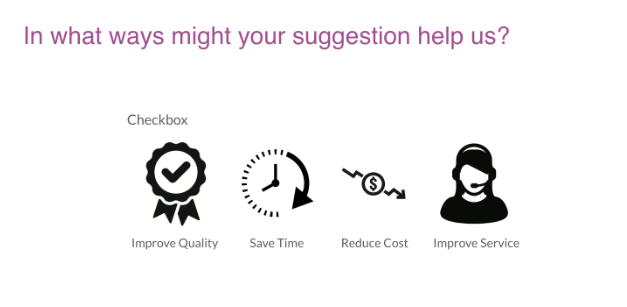
Images can really make a big difference in your survey design. They capture people’s attention better than written words and can help cut down the time it takes to read the survey. In fact, the brain processes images 60,000 times faster than it does text! If you’re unsure of how to use images in a survey, here’s an example from our recent Game of Thrones death pool survey. By adding just two images to our survey, it became more visual and interactive.

DON’T: Use 15 different colors.
Although colors can help make your survey stand out, they can also be overwhelming when used too much. Formstack’s April Fools' Day joke is a great example of why you should avoid using too many colors in your survey design. Although the screenshot is of our form builder and not an actual survey, it proves how using too many colors can become very confusing and distracting.

DO: Highlight the submit button.
Your number one goal when distributing a survey is to gather information from your target audience. If your respondents don’t make it to the end of your survey and never hit the submit button, you miss out on all of their data. Avoid low conversion rates by making your submit button big, bright, and easy to click. Try doing some A/B testing with different calls to action on your survey buttons to see which converts better. You may be surprised by how much a few words on a button can impact your survey submissions!
Read On: Your Crash Course to Collecting More Survey Submissions
DON’T: Make hitting the submit button difficult.
Did you know there’s an optimal button size for mobile surveys? The recommended size is 44px by 44px. Making the submit button smaller than this can make it incredibly hard to click from a phone or tablet, which is the last thing you want.
DO: Utilize white space.
White space is a core element of design. This tenet holds true for surveys. Utilizing white space ensures your surveys don’t look like they are bursting at the seams. Try to shorten longer questions, use page breaks, add sections, and balance questions on the page to increase white space.
This feedback survey is a great example of using white space, images, and a pop of color.

DON’T: Create a 15-page survey.
Using section breaks in a survey can help increase white space, minimize the page length, and create the illusion of a shorter survey. But adding too many section breaks can sabotage your survey. It’s fun to click buttons, but your audience will eventually tire of clicking through page after page. Stick to less than seven pages, and keep each page limited to no more than five questions.
Read Next: 5 Mistakes Killing Your Survey Conversions
Survey Design Best Practices
Here are some survey design tips to follow each time you need to launch a new survey.
View on mobile
You must design your surveys with mobile in mind. Even if you’re using a mobile-optimized survey tool, it’s a smart decision to view your survey on an Android and Apple phone, as well as tablets. This ensures your survey looks good across devices, helping boost your conversion rate.

Pro Tip: Formstack lets you easily preview what your survey will look like on a tablet or phone. Simply click the View Live Form button in the top right of the form builder.
Match your branding
This tip is especially important if you are embedding surveys on your website. Branding your surveys not only makes them look polished and professional, but it also gives you more credibility. Consider adding your logo, colors, and font styles to create a seamless survey experience. It will improve the overall customer experience as well as boost conversions.
Do a test run
Nothing is worse than adding in a cool design element that breaks your survey. Avoid this issue by testing your surveys before you publish. Doing a quick test will help you identify any issues that could tank your survey submissions, such as a broken or poorly-sized image, clashing colors, or strange alignment.
Double check spelling
Spelling and grammar errors are a red flag that an email is spam. The same goes for surveys. While performing your survey test, have a colleague do a spelling and grammar review to ensure your survey is free of errors. This also includes reviewing the promotional copy used to get people to your survey, like emails, social media posts, and web pages.


